1
By petitsapin
By petitsapin
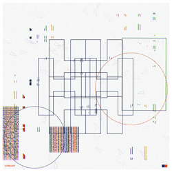
Using single Cyrillic character typography with an inspiration from Soviet era punch cards, technology and mentality to some extent, Such A Lovely Time is part of an ongoing obsession of creating visual complexity from the most basic shapes while retaining a sense of order in appearance. This sense of structure is something that holds true to most of us individuals, communities, nations. However disorganised or frail one may be on the inside one often makes a substantial effort to appear structured, ordered. In other words our orderliness stems from the perception of that very orderliness.
The themes explored in my work are often a bi-product of my echoic memory in which I often pick up on background movie dialogues and tend to remember them by associating a colour and feeling to them. This in turn becomes an artistic direction, drawing inspiration from the sets, colours, location, time period, soundtrack, language and so on. The soundbite and evoked emotions guide the exploration and creation process. More often than not the line from the movie becomes the title for the piece, as is the case for Such A Lovely Time.
Such A Lovely Time has a number of simple traits that when combined create intricate compositions.
-
Three different styles (Grid, Punch Card and Mixed) set the foundation.
- The Grid style is based on a simple grid of elements with varying levels of density.
- While the Punch Card style is essentially also a grid, it has a different rhythm to it, at times very sparse with isolated clusters, at other times those clusters and elements are connected together almost resembling sheet music. In some instances the Punch Card can be very dense almost to the point of saturation.
- The Mixed style is a blend of the two aforementioned and introduces a higher degree of variations and somewhat unexpected results.
-
There are 16 palettes, each one of them named after a city. The colours are extracted from personal travel photos to those cities before being fine tuned.
-
The Cyrillic glyph is the centre piece of the composition, sometimes bold and in the foreground, at times fragmented and sometimes even hidden, as if an invitation to the viewer to look closer and explore the many layered details.
-
The other traits that make up the piece may have less depth in their meaning but add to the overall amount of graphical variations.
Each iteration of Such A Lovely Time is a generative attempt at technical aesthetics.
Created by petitsapin (Dominique McKerl Dautheribes).

Art Blocks Collection: Presents
Project Description: Using single Cyrillic character typography with an inspiration from Soviet era punch cards, technology and mentality to some extent, Such A Lovely Time is part of an ongoing obsession of creating visual complexity from the most basic shapes while retaining a sense of order in appearance. This sense of structure is something that holds true to most of us individuals, communities, nations. However disorganised or frail one may be on the inside one often makes a substantial effort to appear structured, ordered. In other words our orderliness stems from the perception of that very orderliness.
The themes explored in my work are often a bi-product of my echoic memory in which I often pick up on background movie dialogues and tend to remember them by associating a colour and feeling to them. This in turn becomes an artistic direction, drawing inspiration from the sets, colours, location, time period, soundtrack, language and so on. The soundbite and evoked emotions guide the exploration and creation process. More often than not the line from the movie becomes the title for the piece, as is the case for Such A Lovely Time.
Such A Lovely Time has a number of simple traits that when combined create intricate compositions.
-
Three different styles (Grid, Punch Card and Mixed) set the foundation.
- The Grid style is based on a simple grid of elements with varying levels of density.
- While the Punch Card style is essentially also a grid, it has a different rhythm to it, at times very sparse with isolated clusters, at other times those clusters and elements are connected together almost resembling sheet music. In some instances the Punch Card can be very dense almost to the point of saturation.
- The Mixed style is a blend of the two aforementioned and introduces a higher degree of variations and somewhat unexpected results.
-
There are 16 palettes, each one of them named after a city. The colours are extracted from personal travel photos to those cities before being fine tuned.
-
The Cyrillic glyph is the centre piece of the composition, sometimes bold and in the foreground, at times fragmented and sometimes even hidden, as if an invitation to the viewer to look closer and explore the many layered details.
-
The other traits that make up the piece may have less depth in their meaning but add to the overall amount of graphical variations.
Each iteration of Such A Lovely Time is a generative attempt at technical aesthetics.
Created by petitsapin (Dominique McKerl Dautheribes).
Contract Address0x99a9...b069
Token ID400000166
Token StandardERC-721
ChainEthereum
Last Updated1 year ago
Creator Earnings
Such A Lovely Time #166
Owned by
Blondie73
visibility
54 views- PriceUSD PriceQuantityExpirationFrom
- PriceUSD PriceQuantityFloor DifferenceExpirationFrom
keyboard_arrow_down
- Sales
- Transfers
Event
Price
From
To
Date
Such A Lovely Time #166
Owned by
Blondie73
1
visibility
54 views- PriceUSD PriceQuantityExpirationFrom
- PriceUSD PriceQuantityFloor DifferenceExpirationFrom
By petitsapin
By petitsapin
Using single Cyrillic character typography with an inspiration from Soviet era punch cards, technology and mentality to some extent, Such A Lovely Time is part of an ongoing obsession of creating visual complexity from the most basic shapes while retaining a sense of order in appearance. This sense of structure is something that holds true to most of us individuals, communities, nations. However disorganised or frail one may be on the inside one often makes a substantial effort to appear structured, ordered. In other words our orderliness stems from the perception of that very orderliness.
The themes explored in my work are often a bi-product of my echoic memory in which I often pick up on background movie dialogues and tend to remember them by associating a colour and feeling to them. This in turn becomes an artistic direction, drawing inspiration from the sets, colours, location, time period, soundtrack, language and so on. The soundbite and evoked emotions guide the exploration and creation process. More often than not the line from the movie becomes the title for the piece, as is the case for Such A Lovely Time.
Such A Lovely Time has a number of simple traits that when combined create intricate compositions.
-
Three different styles (Grid, Punch Card and Mixed) set the foundation.
- The Grid style is based on a simple grid of elements with varying levels of density.
- While the Punch Card style is essentially also a grid, it has a different rhythm to it, at times very sparse with isolated clusters, at other times those clusters and elements are connected together almost resembling sheet music. In some instances the Punch Card can be very dense almost to the point of saturation.
- The Mixed style is a blend of the two aforementioned and introduces a higher degree of variations and somewhat unexpected results.
-
There are 16 palettes, each one of them named after a city. The colours are extracted from personal travel photos to those cities before being fine tuned.
-
The Cyrillic glyph is the centre piece of the composition, sometimes bold and in the foreground, at times fragmented and sometimes even hidden, as if an invitation to the viewer to look closer and explore the many layered details.
-
The other traits that make up the piece may have less depth in their meaning but add to the overall amount of graphical variations.
Each iteration of Such A Lovely Time is a generative attempt at technical aesthetics.
Created by petitsapin (Dominique McKerl Dautheribes).
Art Blocks Collection: Presents
Project Description: Using single Cyrillic character typography with an inspiration from Soviet era punch cards, technology and mentality to some extent, Such A Lovely Time is part of an ongoing obsession of creating visual complexity from the most basic shapes while retaining a sense of order in appearance. This sense of structure is something that holds true to most of us individuals, communities, nations. However disorganised or frail one may be on the inside one often makes a substantial effort to appear structured, ordered. In other words our orderliness stems from the perception of that very orderliness.
The themes explored in my work are often a bi-product of my echoic memory in which I often pick up on background movie dialogues and tend to remember them by associating a colour and feeling to them. This in turn becomes an artistic direction, drawing inspiration from the sets, colours, location, time period, soundtrack, language and so on. The soundbite and evoked emotions guide the exploration and creation process. More often than not the line from the movie becomes the title for the piece, as is the case for Such A Lovely Time.
Such A Lovely Time has a number of simple traits that when combined create intricate compositions.
-
Three different styles (Grid, Punch Card and Mixed) set the foundation.
- The Grid style is based on a simple grid of elements with varying levels of density.
- While the Punch Card style is essentially also a grid, it has a different rhythm to it, at times very sparse with isolated clusters, at other times those clusters and elements are connected together almost resembling sheet music. In some instances the Punch Card can be very dense almost to the point of saturation.
- The Mixed style is a blend of the two aforementioned and introduces a higher degree of variations and somewhat unexpected results.
-
There are 16 palettes, each one of them named after a city. The colours are extracted from personal travel photos to those cities before being fine tuned.
-
The Cyrillic glyph is the centre piece of the composition, sometimes bold and in the foreground, at times fragmented and sometimes even hidden, as if an invitation to the viewer to look closer and explore the many layered details.
-
The other traits that make up the piece may have less depth in their meaning but add to the overall amount of graphical variations.
Each iteration of Such A Lovely Time is a generative attempt at technical aesthetics.
Created by petitsapin (Dominique McKerl Dautheribes).
Contract Address0x99a9...b069
Token ID400000166
Token StandardERC-721
ChainEthereum
Last Updated1 year ago
Creator Earnings
keyboard_arrow_down
- Sales
- Transfers
Event
Price
From
To
Date

